
Nothing Phone (2). If you’ve been eyeing this smartphone since its launch and can’t decide whether to make the leap, this article is tailored just for you. I have been using the Nothing Phone (2) (review) as my daily driver for well over a month now. The handset is a good upgrade from its predecessor, the Nothing Phone (1). But is that reason enough to buy this smartphone, or is there more to the Nothing Phone (2) than meets the eye? Keep reading to find out.
What works
Glyph interface
The Glyph interface remains the standout feature of the Nothing Phone (2), capturing a significant amount of attention and becoming an immediate topic of conversation. With the Phone (2), the Glyph interface now boasts a broader range of use cases compared to its predecessor, thanks to the addition of 33 new individual Glyph LED zones.
Read more: 7 things you can do with Nothing Phone (2)’s Glyph Interface
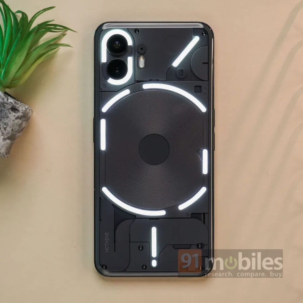
The Glyph timer feature stood out as particularly useful, aiding me in monitoring timer progress during activities like planks and workouts without lifting the device or waking up the screen. This functionality seamlessly integrates with third-party apps such as Uber and Zomato, enabling you to effortlessly keep track of the remaining time for booked rides or food deliveries through the Glyph interface to arrive at your location. However, it does require some adjustment and familiarity. I booked an Uber ride only once during my time with the device, and my natural inclination was to check the device’s screen rather than the Glyph interface to monitor its progress. Maybe over time, you might get used to it.
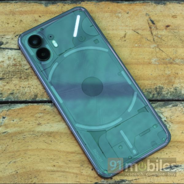
Apart from this, there is Glyph notification, which lets you configure the top right light strip on the back of the phone to illuminate and alert you exclusively for notifications from specific apps when the phone is face down and on silent. It’s a handy feature to have, as long as the device remains within your line of sight. Otherwise, you might end up missing most of these notifications, which is exactly what happened to me. Besides this, there is new visual feedback for volume control, which I didn’t find particularly useful. The same was the case with the new Composer app, which lets you compose your custom ringtone with visual effects.
Having said that, the initial excitement surrounding the Glyph interface dwindled for me after the first few days of use. I eventually started using the Nothing Phone (2) as a regular smartphone. Additionally, the Glyph interface’s ability to reduce unnecessary screen time caused by irrelevant notifications, through the Flip to Glyph feature, didn’t really prove very effective for me. I found myself checking my smartphone every time the LED lights flashed for notifications. But hey, not every person has this urge to check each and every notification. If you feel that you are one of those individuals, then the Glyph interface might be a good match for you.
Software
Software is another major aspect of the Nothing Phone (2). It is clean, simple, and minimalistic. The company promises three major software upgrades for the smartphone, making it future-proof. For now, the handset runs Android 13-based Nothing OS 2 out of the box, which delivers close to stock Android interface. There are custom apps, but they don’t crowd the app drawer as much as some of the other custom Android-based smartphone UIs. Apart from this, the handset comes with a few pre-loaded widgets, such as clocks, weather, quick settings, calendar, and Nothing X, which are a great match to the UI.
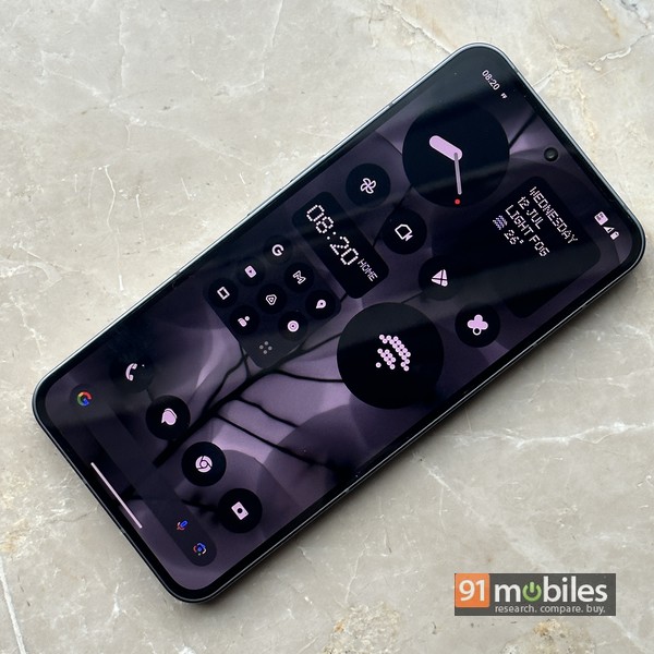
The company has also introduced a new Monochrome UI, which has a black-and-white theme. However, it isn’t compatible with every app icon out there yet. I was happy to switch to the ‘default’ icon pack, which features the familiar stock Android icons. The software still needs a few tweaks, since the Glyph interface stopped working for me once. Nevertheless, the company has been quick to release new updates to resolve these issues. During my time with the device, it received a couple of updates, which not only fixed the bugs but also included some enhancements such as improvements to the cameras.
Cameras
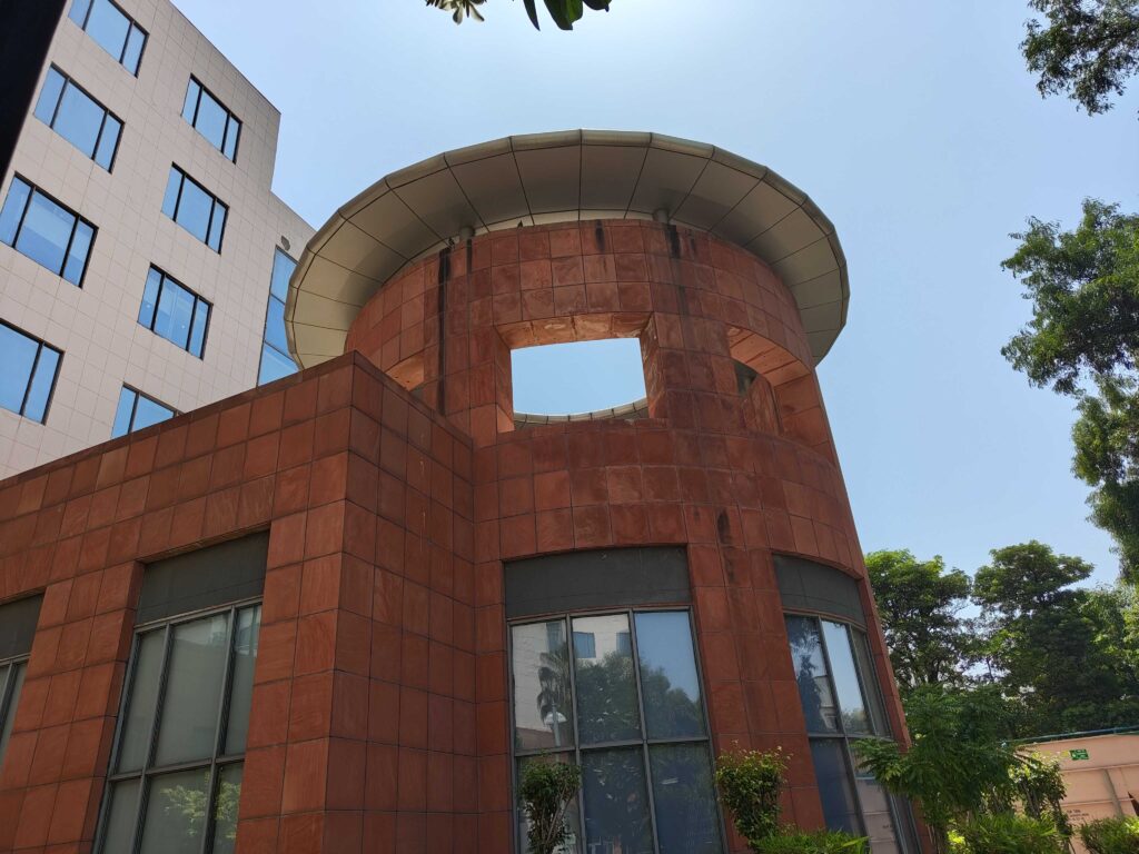
Speaking of which, the Nothing Phone (2) cameras have improved with faster HDR processing and more clarity, among other things. I must say the cameras thrive in areas where there is plenty of light. The camera prowess even matches some of the more expensive smartphones in certain scenarios. The handset is equipped with 50MP primary and ultra-wide cameras at the back, both with OIS and EIS. The primary 50MP camera is capable of capturing likeable shots in daylight with vivid colours and plenty of sharpness. The phone’s Adaptive HDR further enhances the camera’s ability to capture a better dynamic range. Moving on, the 50MP ultra-wide sensor also performs well, with some typical cropping at the corners of the frame in daylight shots. There is no telephoto lens on this smartphone, but you can utilise the 2x zoom feature with the primary camera, which captures usable shots in well-lit environments.
Design
As slippery as it may be, the Nothing Phone (2) design stands out… sort of. It looks mostly like its predecessor, but the handset boasts subtle changes, such as the 2.5D curved glass at the back, that enhance its ergonomic usability. I found the device comfortable to wield, despite its big form factor and relatively chunky and hefty design. The Phone (2) measures 8.6mm in thickness and weighs 201 grams.
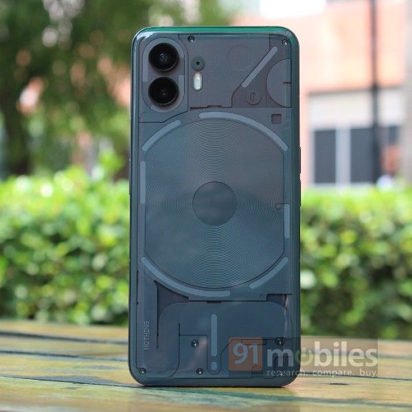
Additionally, the flat-edged aluminium frame of the device makes it easy to handle. Its edges don’t dig into your palm during use, and the phone’s corners are gently curved to ensure convenient single-hand usability in a variety of scenarios. That said, accessing the far corners of the phone might require a bit of finger gymnastics at times. The handset also exudes remarkable sturdiness, although this may not be fully reflected in its IP rating, which stands at a modest splash-resistance certification of IP54. However, the major attraction point of the phone has to be its transparent back, which gives a peak at its neatly arranged magnetic coil, flat power cables, Glyph lights, and more.
While the Nothing Phone (2) may seem attractive without a case or skin, we highly recommend getting one immediately to prevent potential dents. The handset offers no traction, making it prone to slipping out of loose pockets or sliding on even mildly slanting surfaces. I experienced this firsthand when it fell from my study table, resulting in a small dent around the top corner.
Display
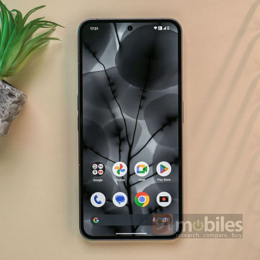
The Nothing Phone (2) offers a pleasing viewing experience, with its 6.7-inch 10-bit AMOLED display that bears FHD+ (2,412 x 1,080) resolution, 1600 nits of peak brightness, and HDR10+ support. The display uses LTPO tech that can dynamically switch the screen refresh rate between 1Hz and 120Hz based on the content. You have the option to lock the refresh rate to 120Hz within the phone’s settings, but that would lead to higher battery consumption. While the display is a bit reflective, it is highly legible when used outdoors under direct sunlight conditions.
Be that as it may, the display excels in rendering content with vivid and vibrant visuals. It has the HDR mode activated by default, and there are minimal bezels, almost borderless, which enhances the overall viewing experience. Furthermore, the handset lets you play around with the display colour profile. I personally had it set to ‘Standard’ from the default ‘Alive’ mode, as it appeared more pleasing to my eyes.
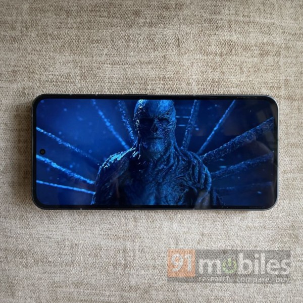
Besides that, the device is Widevine L1 certified, guaranteeing seamless streaming in FHD resolution from OTT platforms like Netflix. It also boasts stereo speakers for a complete audiovisual experience. While the display is a bit reflective, it is legible when used outdoors under direct sunlight conditions.
Performance
Under the hood, the Nothing Phone (2) rocks a Snapdragon 8+ Gen 1 chipset, coupled with up to 12GB RAM and 512GB storage onboard. It is a flagship-grade chipset, if not THE flagship, that manages to run things smoothly on this device. The handset muscled its way through most of the things I threw at it, including multitasking and running graphically demanding games like BGMI. The phone also achieved remarkable scores on both Geekbench and AnTuTu benchmarking tests, with minimal CPU throttling observed during the CPU Throttle test. Considering the robust processing capabilities of the chipset, the Phone (2) is expected to maintain its smooth performance in the long run.
The Nothing Phone (2) is 5G-capable. Here’s a 5G speed test done on the device using the Airtel 5G Plus network in Faridabad, Haryana:
![]() Battery
Battery
The Nothing Phone (2) delivers a solid battery life, even though it packs a relatively small 4,700mAh cell. It effortlessly lasted me through a full day of use, which included activities like streaming, scrolling through social media, web browsing, navigation, and more. Even on days when I added gaming to the mix, the handset only reported a slight dip in battery life, but I still managed to go through the entire day without the need to reach for a charger. The handset delivered approximately six hours of screen-on-time without an Always-on display.
What doesn’t work
Lowlight photography

Despite improvements with software updates, the Nothing Phone (2) lowlight photography feels below par. The handset produces underexposed images with minimal details and washed-out colours. The phone struggles to focus on subjects and minimise noise effectively. Fortunately, there is a Night mode on the smartphone, which reduces graininess but smoothens out the details. Another thing that I have noticed is whether it is daylight or lowlight, the handset takes a fraction of a second more compared to other smartphones to click and process images. This can be a little frustrating when you have to capture multiple shots quickly.
Charging speeds
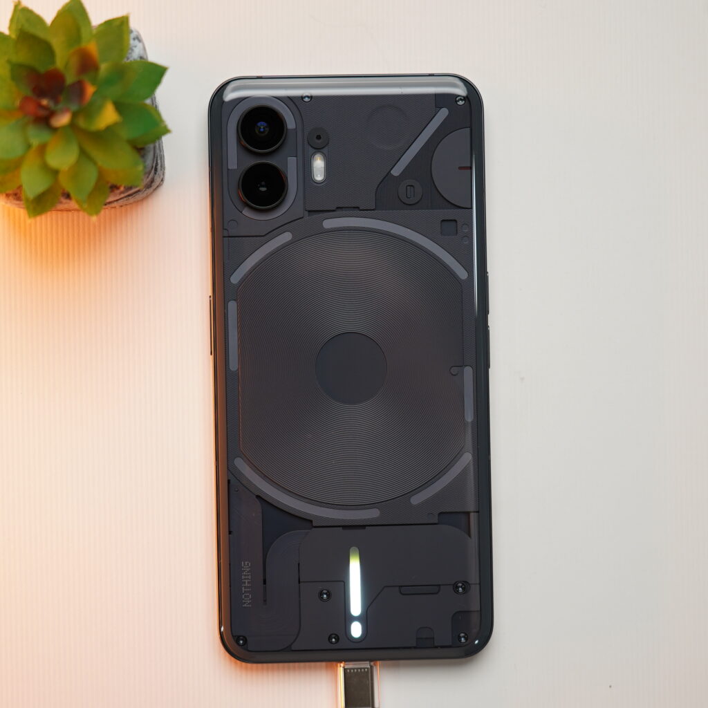
The Nothing Phone (2) charging speeds are relatively slow. The handset supports 45W fast wired charging and 15W wireless charging. I used a 33W charger to charge the device, and it took more than 90 minutes for a full charge. However, if you happen to have a 45W charger (which is not included in the box), the handset can reach 0-100 percent in a little over an hour. This seems to be on the slower side, considering there are options within the segment market that provide much faster charging speeds.
Price
The Nothing Phone (2) is a good smartphone from a brand that is relatively new, but it could have been priced more competitively. The handset originally retailed in India starting at Rs 44,999, and this pricing doesn’t seem to align with its price-to-performance ratio. However, thanks to festive sales going on at the moment, you can get it for lower. You should know that aside from the Glyph interface and clean interface, the phone doesn’t really stand out much when compared to other smartphones within the segment though.
Verdict
The Nothing Phone (2) isn’t amazing in low-light photography and charging speed, and its original pricing may deter budget-conscious buyers. The recent discounts on offer as part of the ongoing festive sales that bring the price down to Rs 36,999 (after bank discounts) do make it a more enticing option. If you value design and innovation, the Nothing Phone (2) has its merits, but the likes of the Pixel 7 (review) and OnePlus 11R (review) could also be quite appealing in this price range. All said and done, the Nothing Phone (2) comes with a lot of positives that make it an attractive choice. Its design, featuring a unique transparent back, and its ergonomic build make it stand out. The display offers a vibrant and immersive viewing experience, while the Snapdragon 8+ Gen 1 chipset ensures top-notch performance. The promise of long-term software support is commendable, and the Glyph interface adds a touch of innovation.
The post Nothing Phone (2) revisited: design, performance, and more first appeared on 91mobiles.com.
from 91mobiles.com https://ift.tt/cSlX4Y6

 Battery
![tTorrent Ad Free Pro Apk [Latest]](https://blogger.googleusercontent.com/img/b/R29vZ2xl/AVvXsEgjcrLysU0qIvlLhmpUMn9_VbPwFKIWKkKyqWb_gAHSC-lFbgzBRZksHccGVpWYuBEOF1fghNUq9ZAU1EXfRtkRRrmx5joDVqoiXfvDmFFb4romeDJcwmGD8kk3XpaXVmgND9fJ5RZ8eIE/w680/tTorrent-Pro-Apk.jpg)
